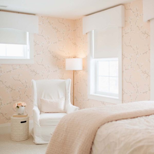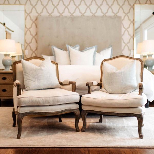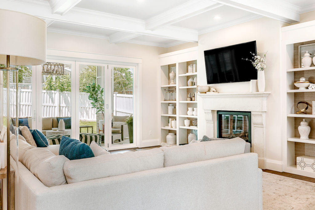
It’s no secret I’m a sucker for neutrals, specifically white! Adding even navy accent pillows seems like “taking a chance” to me :). If you’re a fellow lover of all things neutral, a rule to follow is add texture!! Texture helps to give even a white-based color palette depth.
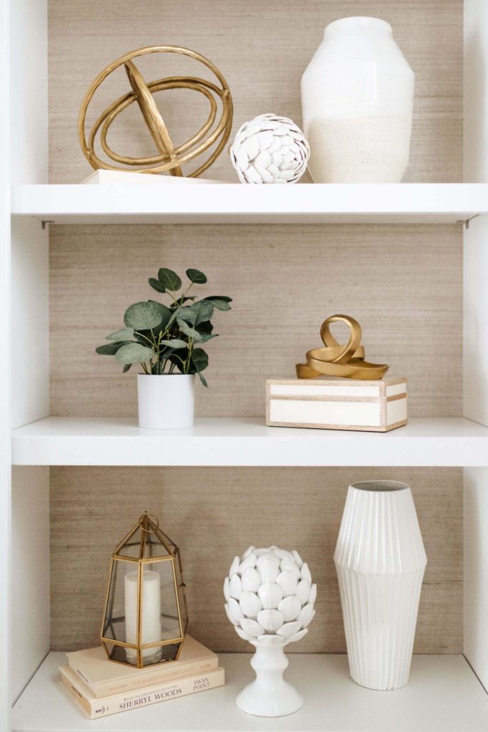
Two immediate ways we added texture to the living room: a gold toned grasscloth wallpaper used as backing on the white book shelves, and the white box beams that make up the coffered ceiling.
The Goal
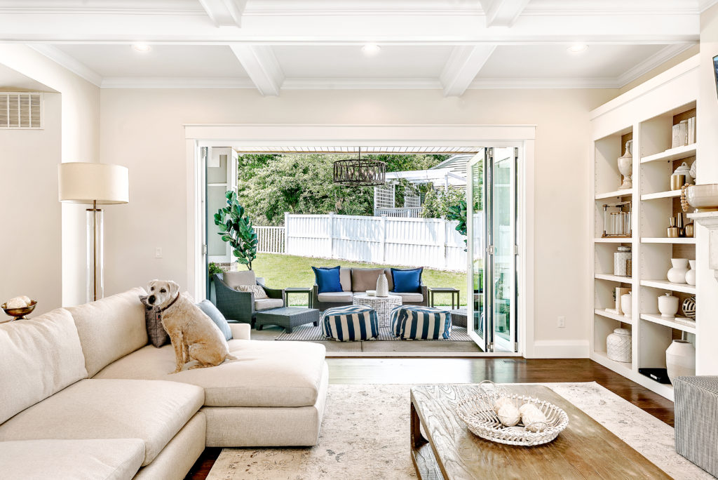
Continuing the open floor plan established in the kitchen, we wanted to extend our indoor space into our outdoors. Lucky for us in Colorado, we are able to keep the infinity doors wide open for about half the year!
The Design
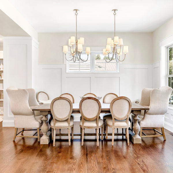
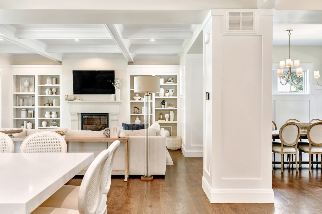
While we loved the idea of one large open space, we also wanted each “room” to have a sense of intimacy. Dipped ceiling beams and columns are used as transitions to delineate between rooms—the formal dining area, living room, and kitchen.
The Details
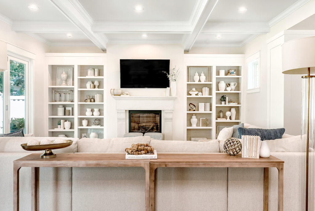
We used a golden toned grasscloth wallpaper as backing on these bookshelves. Both the color and texture help the white objects and chotskies placed on the shelves to really pop!
As far as decorating the book shelves, I incorporated varying shades of white and gold to extend the neutral palette. You can see the cream books used to give height and interest to the variety of clusters.
