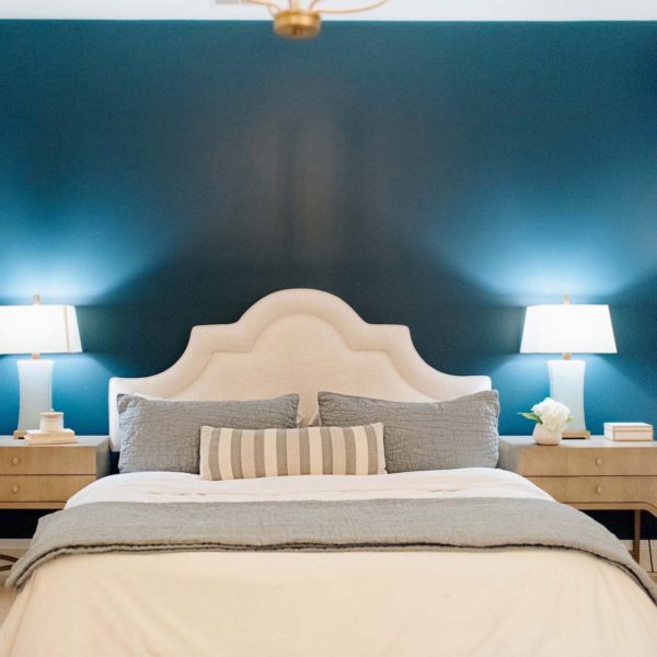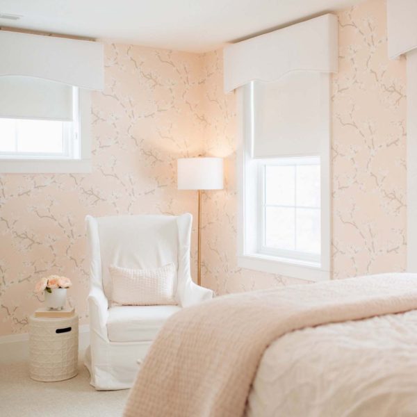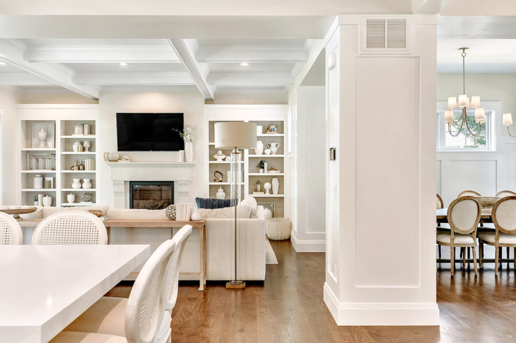
No matter what your style: modern, Scandinavian, traditional, French country, or Tuscan, just stay consistent! Continuity allows you and your guests to luxuriate in the warmth and mood that your home commands.
It’s always amazed me how a well-appointed home can affect your mood, your sense of self, confidence, even your productivity level! Tell this to your husband the next time he puts the kibosh on that Target throw pillow.
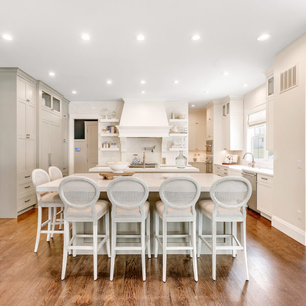
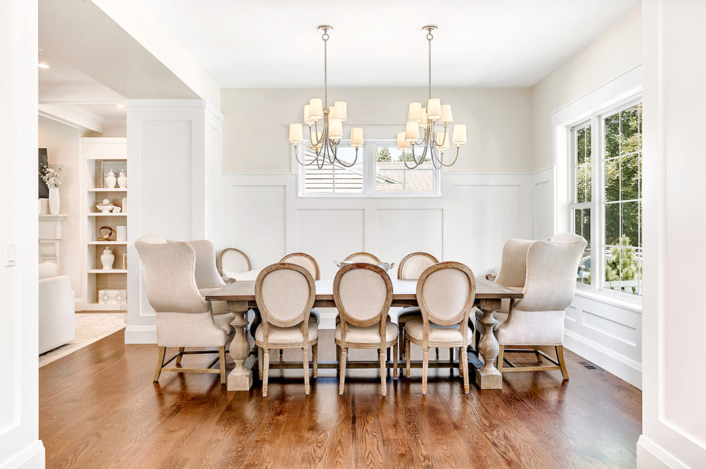
My “mood board” for past homes changed with each new home my husband built. With several under our belt, I feel like we finally settled on the style that feels most “us”: we present traditional meets coastal. Think white trim, navy accents and the light fixtures complete with shades.
The Goal
Complete with a “mood board”, I lug around a “mood box.” I fill it with samples, samples and more samples! Wallpaper clips, floor stain, wall paint color, cabinet colors and countertop blocks. Then before any purchase, big or small, you can see how it mixes and flows with the rest of the house.
The goal of our home was to stay loyal to these tests in order to make it look like every rug, accessory, vase, and chair was chosen thoughtfully.
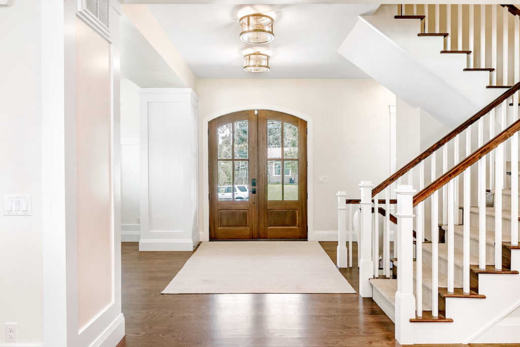
The Design
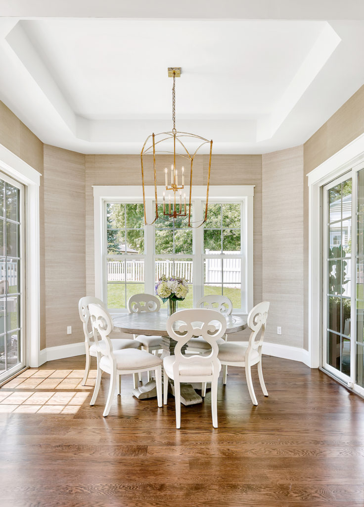
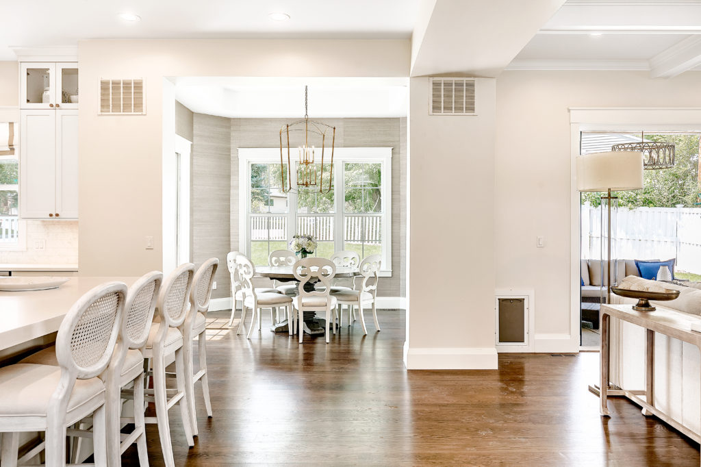
I often get asked about my favorite room in the house. For me, it’s a no brainer: the eating nook. It’s hard to have your mood not changed for the better when bathing in the sunshine that this little room showcases.
I also love the versatility of the room. It’s our go-to for a more casual dining option, but can also easily transform to elegant for more formal dining. We used the same golden grasscloth wallpaper on the nook walls as we did on the backing of the bookshelves. I think this helps to pull together the two areas. Lastly, we didn’t want a fixture that would block any of the light. Thus, we decided on this thin yet oversized open faced golden lantern light pendant selected to pull in the gold tones of the wallpaper.
The Details
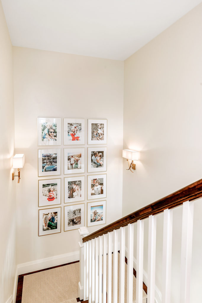
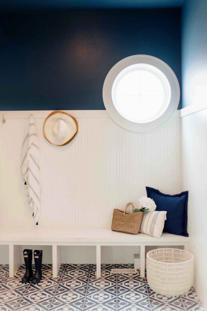
Two of my favorite areas in our home that we elevated by thinking “details”: our gallery wall and mudroom.
On the landing of our stairs, there is a giant wall that screamed the need for some cute family portraits. I used a uniform frame size and consistent filter on all the photos to add a more professional gallery look.
As for our mudroom, the navy ceramic patterned tile sets the tone for the rest of the room. You can see the panel of stark white beat board is contrasted with the navy upper half of the wall, even navy ceilings (difficult to see in below picture). Love the stark variation in colors!
